New York City: The Greatest City in the World
In 1626, Peter Minuit bought the southern tip of Manhattan for 60 guilders, or $1,150 in today's dollars, from the Lenape people. Now, NYC is home to 8.26 million people and a global hub of diversity, culture, finance, and art.
The Objective
I redesigned a website for New York City, optimized for residents' ease of navigation. My target audience is NYC residents, as I feel that many websites about NYC are for tourists and there is not much support for those living in the city.
What We're Working With
I researched both NYC's existing government website and the NYC tourism website:
nyc.gov has a banner to lead users to the tourism website. The Resources page is comprehensive but not well designed; it reads like an HTML list. Some webpages lead to different websites, so nothing is standardized. Colors change depending on the webpage, which is a quick and easy way to visually differentiate information.
nyctourism.com is a fun website, with bright colors and bold typography. Its style wouldn't work for the main NYC website, which has to be more functional than the tourism website. Information is well-organized into clear sections and users can navigate it with ease.
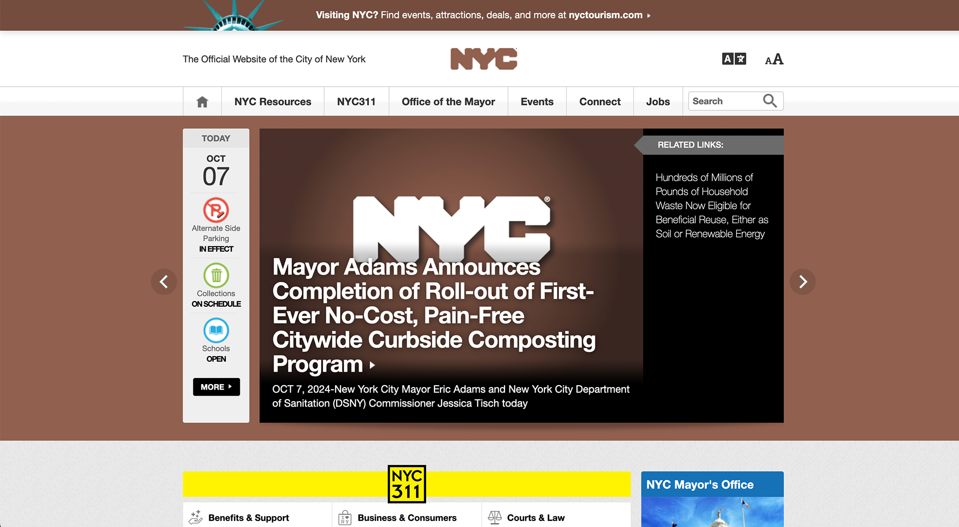
NYC's website homepage
Los Angeles and London: Better or Worse?
I conducted a competitive analysis on two similar sized cities, Los Angeles and London:
lacity.gov also has a "Discover LA" banner, which is a simple way toget to the tourism website if you are looking for things to do. Each page is set up similarly with a picture header and a subtitle. Type and other visual elements are understated, which contrasts the vibrant and dynamic pictures. Icons follow a system and are the same accent indigo color, making them easy to find.
london.gov.uk also has a clear system as each page is set up similarly. The Home page is harder to get back to only since the header doesn’t have a link to it. Pages are harder to navigate to because the menu is a sidebar. Colors are clean but understated, everything is organized thematically.
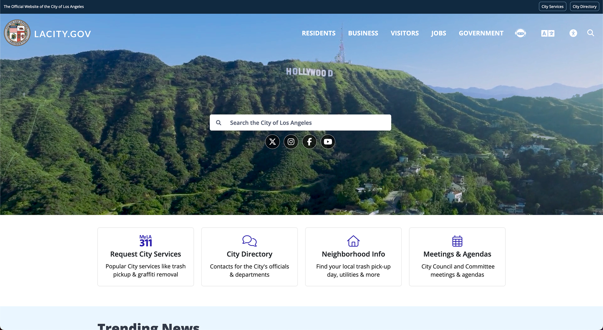
Los Angeles' website homepage

London's website homepage
Understanding residents
I used artificial intelligence to create user personas in order to best understand my audience and their needs.
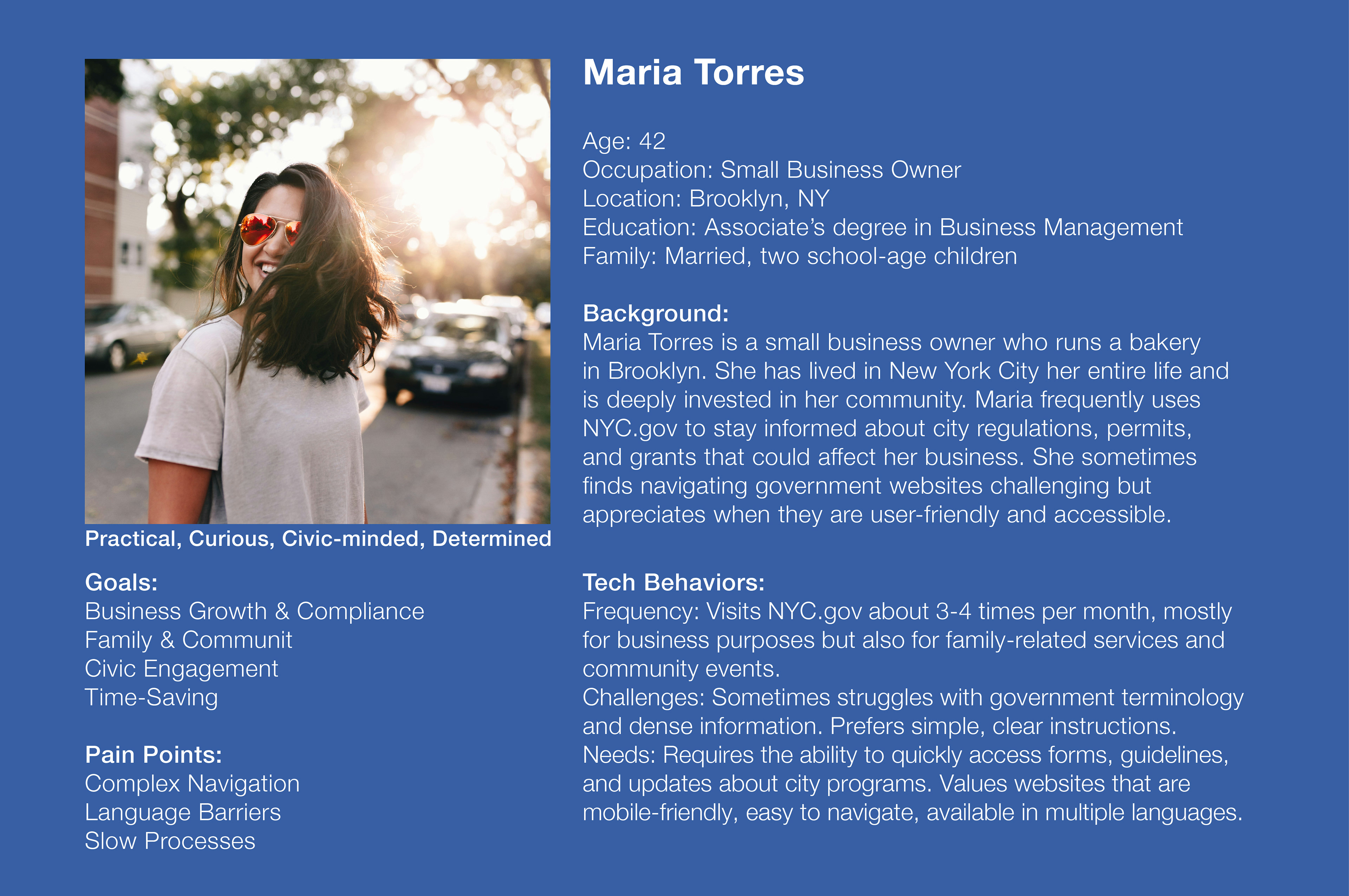
Maria Torres, a mom and small business owner

Jamal Johnson, a public school teacher from Queens
Dull colors lets the city shine
NYC does not have a brand color, so I used darker shades of the NYC tourism website’s colors, as bright colors would overwhelm the webpages, especially considering the colorful images I will use. I added purple to expand the range of these colors, especially since I need one color per website section in order to help with navigation.
NYC uses Helvetica Neue for their brand typeface.
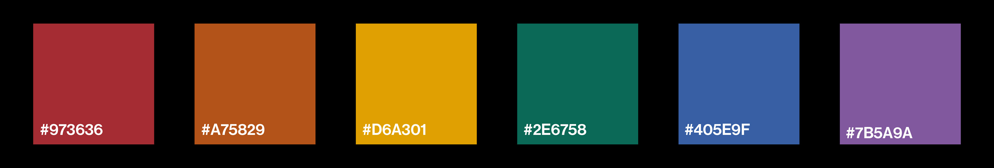

NYC brand colors from left to right: dark cherry red, burnt orange, buttery yellow, teal green, evening blue, and grape purple.
What would I want?
When brainstorming pages to add to this site, I thought about what would benefit residents the most, given my user personas and my own experience as a NYC resident. I thought it'd be useful to have a "Featured" section since a lot happens in the city and not many people know about cool events. I also thought it would be interesting to have a "Public Bathrooms" page where you could search for bathrooms near you.
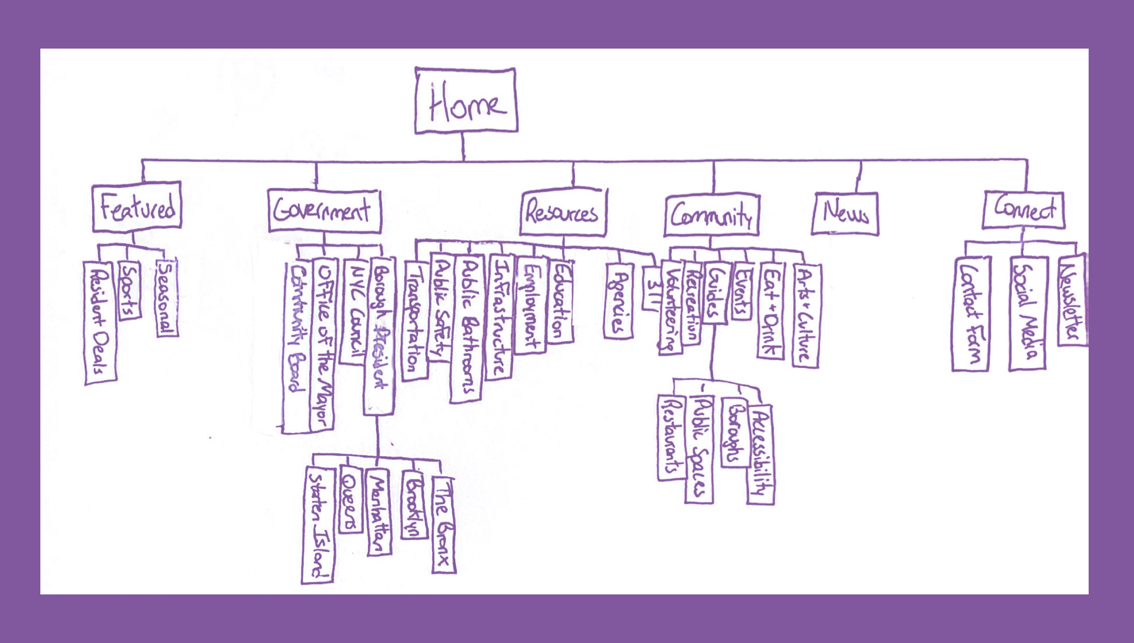
A comprehensive sitemap of all the pages this website will have. Some pages were added and others were removed the final website.
Wire frames

A sample of low fidelity wire frames created for the website.
Final Screen Designs
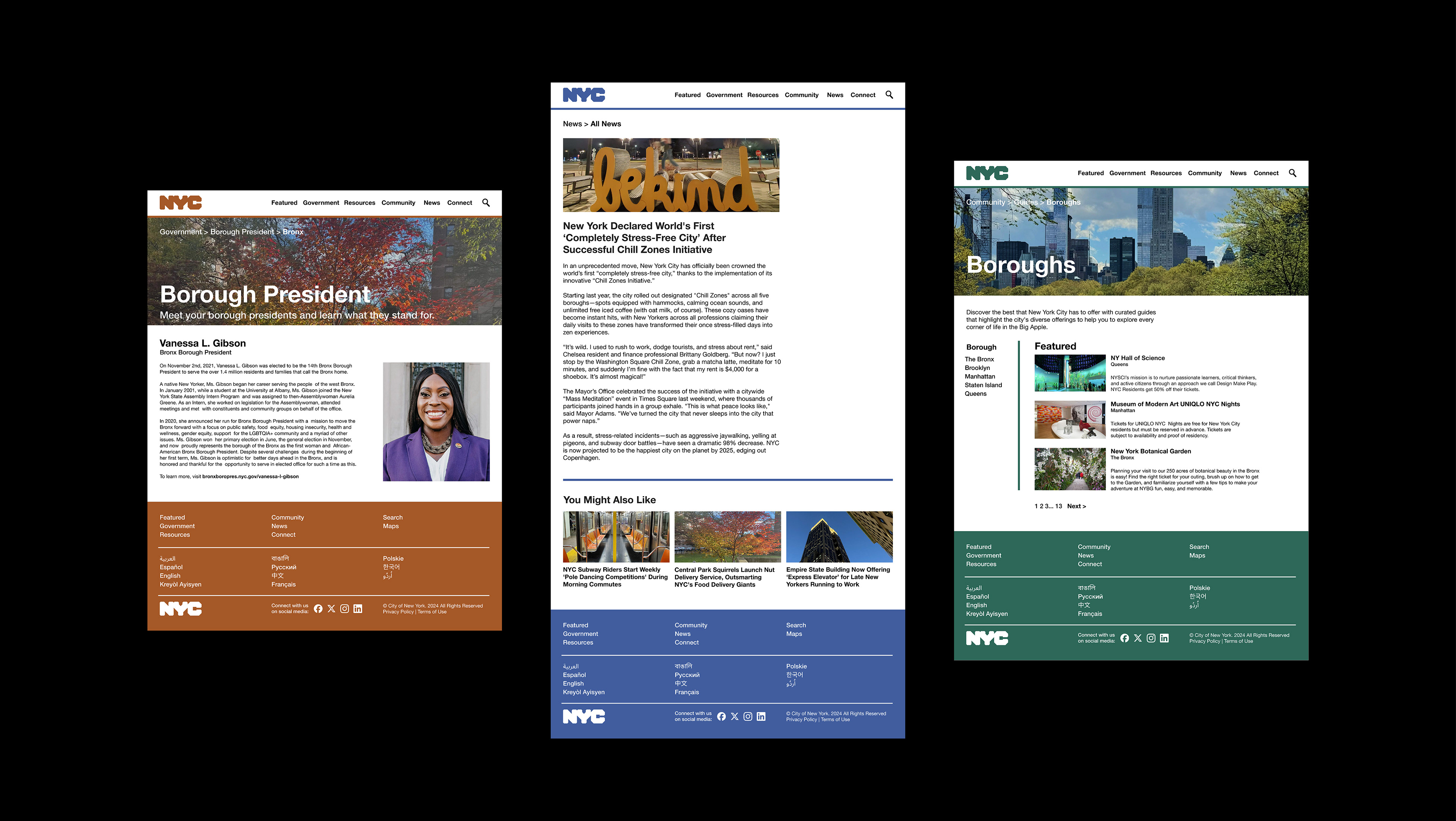
Bronx Borough President, a News article, and the Boroughs Guide webpages
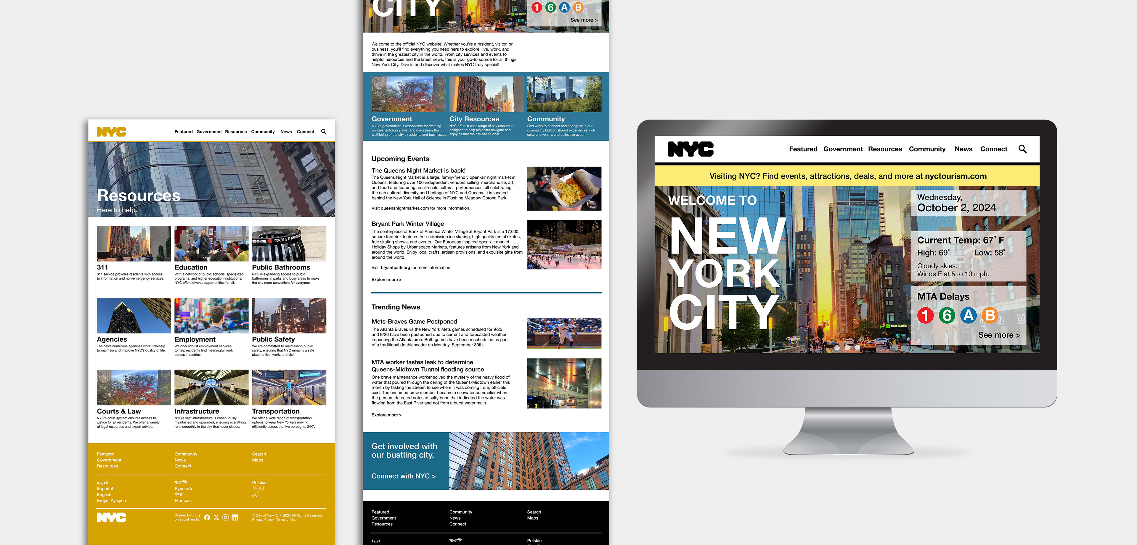
Resources and Home webpages
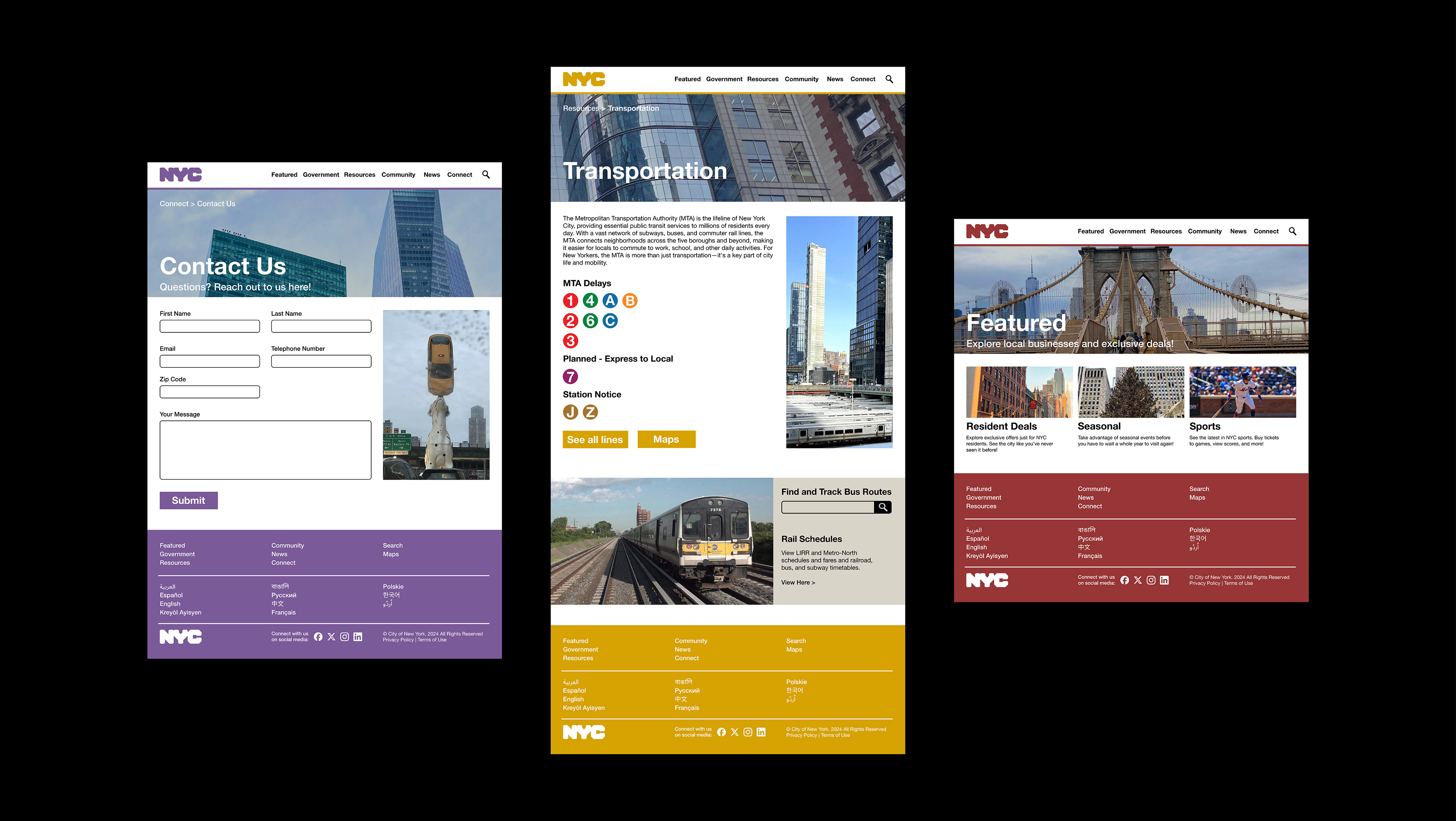
Contact Us form, Transportation, and Featured webpages
What I Learned
Users need to know where they are: I accomplished this in two ways. The first was color coding, which is such an efficient way to make navigation easier since allows you to easily see what page you're on, which is especially important on a website as big as this. Breadcrumbs and user feedback help users track their history. I have a lot of nested webpages, and breadcrumbs definitely makes this site more navigable.
NYC is amazing: I've lived in NYC all my life, and through my research I realized the extent of city resources and events available to us as residents of the greatest city in the world. This project taught me so much about my "hometown" and I can't wait to go explore what the city has to offer when I have the chance!
Credit
ChatGPT was used to write body copy for the following webpages: Home, Resources, Featured, Resident Deals, Seasonal, Employment, Explore Careers, Transportation, Community, Guides, Boroughs, News.
I asked my friends who live in the city to contribute pictures for
the website. Picture credit goes to Joey Tam, Nicole Luo, Sam Ruan,
Chara Esquea, and myself.