A collection of posters I've made over the years!
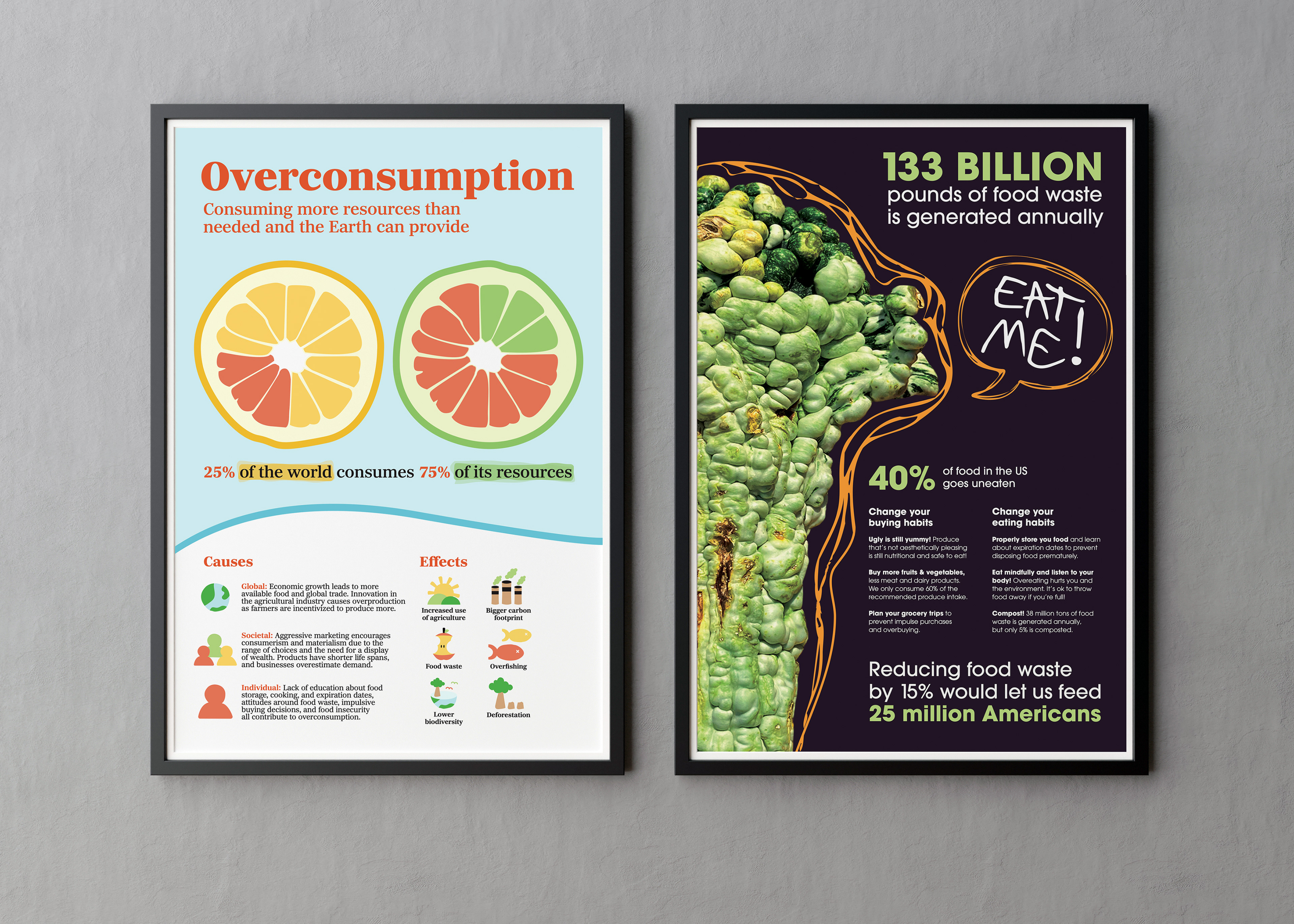
These two posters aim to address the same topic to two different audiences, created after extensive research into overconsumption. The left one targets those who do not know what overconsumption is, and the one on the right targets those who are aware of it and want to reduce their overconsumption.
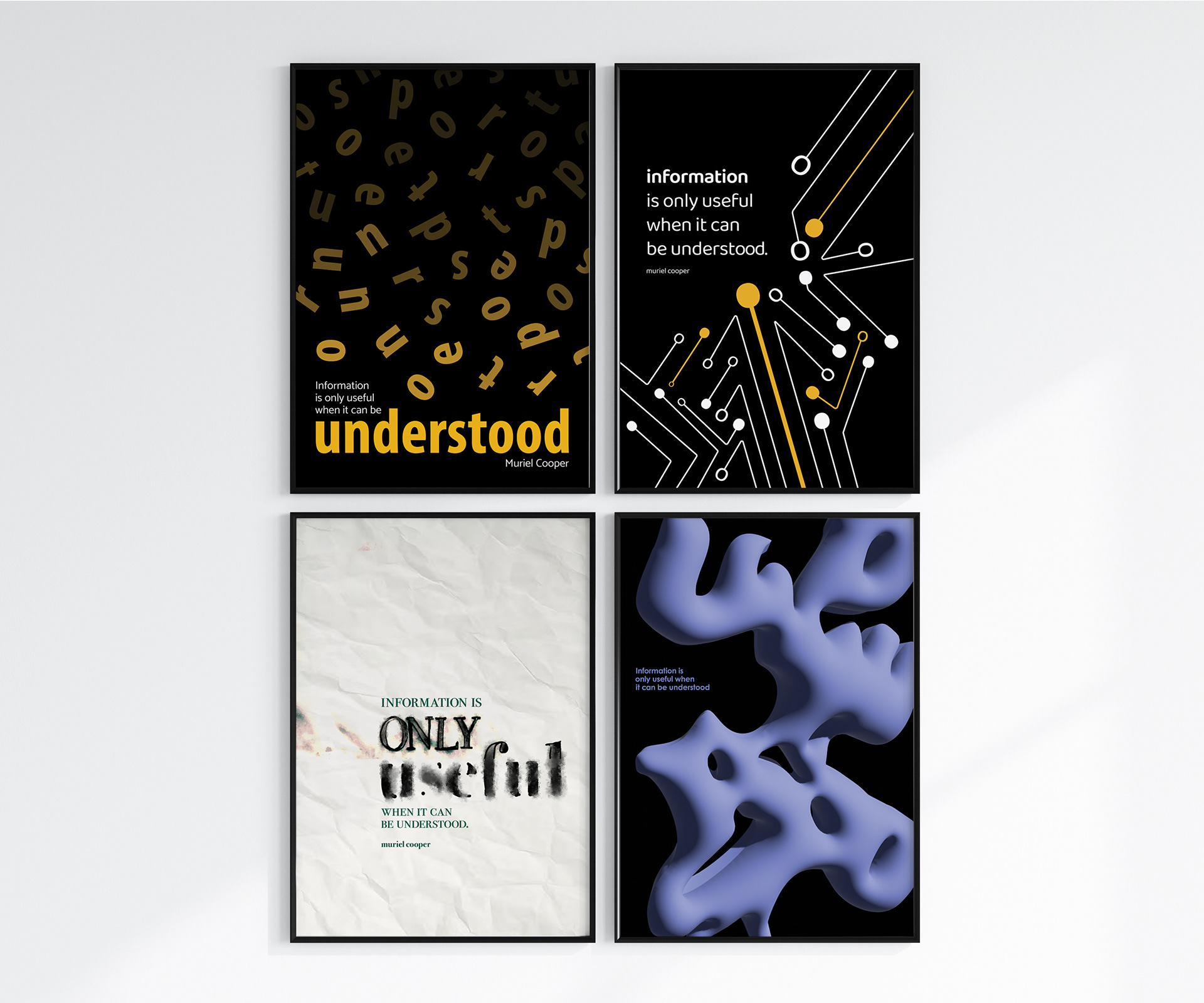
I interpreted this quote by Muriel Cooper to mean that that a message is only effective when it can be comprehended. It doesn’t matter how important your message is if no one can make sense of what you’re saying.
This quote had a lot of potential as it had three words that I could potentially focus on: information, useful, and understood. Each poster emphasizes a different word, experimenting with hierarchy, legibility, and different forms of communication.
The top left one explores how comprehending information is a gradual process, and the top right one is about communication via technology and electric current in our modern society.
The bottom left one is about information communication via physical tools of creation, and the bottom right one explores the irony of "understanding" through illegibility.

A tourism poster for San Francisco, designed after conducting research and writing copy. Colors in this poster are inspired by a sunset in San Francisco, when the light hits both the water and the Golden Gate Bridge.

Inspired by the improvisation and rhythm of jazz, I superimposed three treble clefs to create the unique shapes seen here. The shapes represent different instruments, uniting to produce the unique sound that is jazz.